


So I'm back with another small post to show how you can leverage directives to do magical things in your Angular application. Directives are really powerful. Once you get to know about the, you can start leveraging it to move your imperative logic into directives.
What we are going to build?
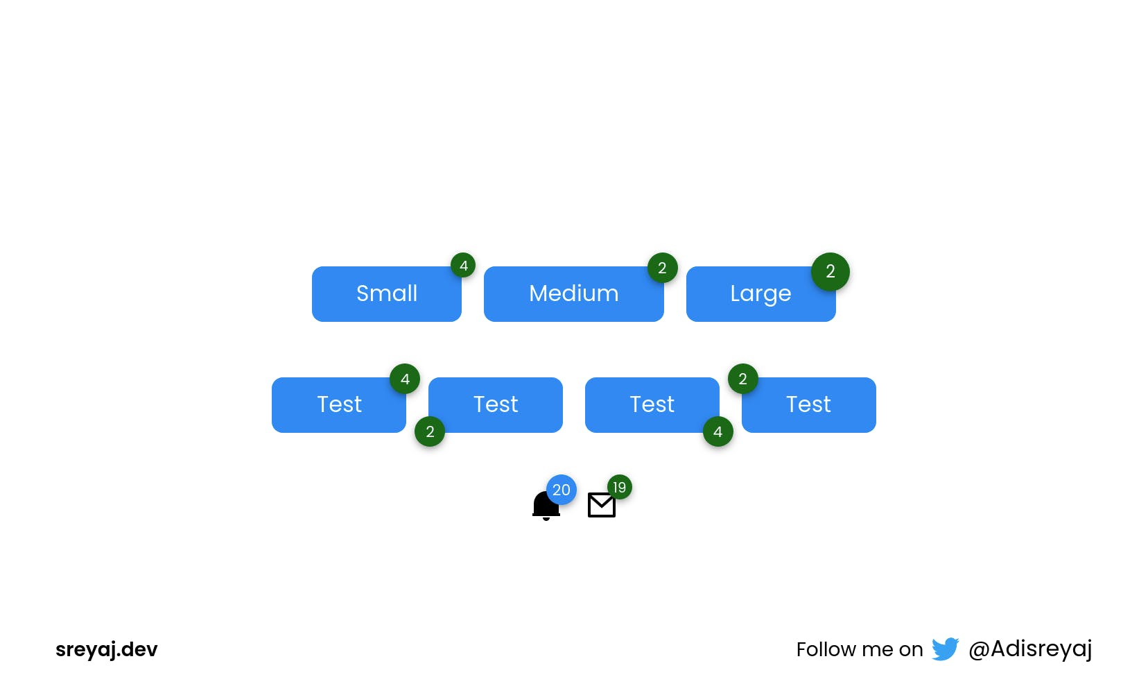 The component that we are going to build today is a very simple badge component. Badges are present in almost all of the UI frameworks I can think of.
Badges are status descriptors that generally show information like the number of unread emails/notifications or maybe the number of selected items for deletion.
The component that we are going to build today is a very simple badge component. Badges are present in almost all of the UI frameworks I can think of.
Badges are status descriptors that generally show information like the number of unread emails/notifications or maybe the number of selected items for deletion.
We are going to use a pattern that is used by Angular Material. My intention with this post is to show you how these libraries do it. We just use what the library gives us, and most of the time we use it without actually knowing how it works.
By the end of the post, you would definitely think Was it always this easy to make cool stuff?
Why Directives?
This is a very valid question that you can have. Why can't we just have a simple div and then style it accordingly in our component? Well, you can do that.
But when you want the same in multiple components, it's better to extract it out of the component and write it as a separate component.
This way our component code would look much simpler.
Directives can be easily added to HTML elements and it plays nicely with the template flow.
<button class="button button-with-badge">
  <p>My Button</p>
  <span class="badge some-class">18</span>
</button>
or
<button class="button" badge="18">My Button</button>
Which do you think is better?
Today, we will build out badge directive, which adds a small badge on top of elements it's added to.
Planning out
So what we ideally want the directive to do, is to add a new element with the badge content and then position it as absolute to the host element.
We need to create an element dynamically and attach it to the host element.
Even though we can use Rendered2, I recently came to know that the Material team is also moving away from it and relying on the native approach instead. We can access the Document by injecting the DOCUMENT token which is provided by Angular.
import { DOCUMENT } from "@angular/common";
constructor(@Inject(DOCUMENT) private document: Document){}
This would give us access to the Document object.
So when we find that our badge directive is attached to some element, we create a span element and then append it to the host element. Simple, isn't it?
Now let's see how we code it out!
Badge Directive
As always, we start by creating a directive and a module for that directive. The module will declare and export our directive. So wherever we need to use our directive, just import the BadgeModule and the directive should be available for use.
import { CommonModule } from "@angular/common";
import { NgModule } from "@angular/core";
import { Badge } from "./badge.directive";

@NgModule({
  declarations: [Badge],
  imports: [CommonModule],
  exports: [Badge]
})
export class BadgeModule {}
Here are some customization options we will be providing to the directive:
- Sizes
- Badge Position
- Color Variants
- Custom Classes
@Directive({
  selector: "[badge]"
})
export class Badge implements OnChanges, OnDestroy {
  @Input() badge = null;
  @Input() size: BadgeSizes = "medium";
  @Input() position: BadgePositions = "top-right";
  @Input() customBadgeClasses: string | null = null;
  @Input() variant: BadgeVariants = "secondary";

  badgeElement: HTMLElement | null = null;

  constructor(
    @Inject(DOCUMENT) private document: Document,
    private elRef: ElementRef<HTMLElement>
  ) {}
  ngOnChanges(changes: SimpleChanges): void {
    if ("badge" in changes) {
      const value = `${changes.badge.currentValue}`.trim();
      if (value?.length > 0) {
        this.updateBadgeText(value);
      }
    }
  }

  ngOnDestroy() {
    if (this.badgeElement) {
      this.badgeElement.remove();
    }
  }

  private updateBadgeText(value: string) {
    if (!this.badgeElement) {
      this.createBadge(value);
    } else {
      this.badgeElement.textContent = value;
    }
  }

  private createBadge(value: string): HTMLElement {
    const badgeElement = this.document.createElement("span");
    this.addClasses(badgeElement);
    badgeElement.textContent = value;
    this.elRef.nativeElement.classList.add("badge-container");
    this.elRef.nativeElement.appendChild(badgeElement);
    return badgeElement;
  }

  private addClasses(badgeElement: HTMLElement) {
    const [vPos, hPos] = this.position.split("-");
    badgeElement.classList.add("badge", vPos, hPos);
    if (this.customBadgeClasses) {
      const customClasses = this.customBadgeClasses.split(" ");
      badgeElement.classList.add(...customClasses);
    }
    badgeElement.classList.add(this.variant);
    badgeElement.classList.add(this.size);
  }
}
Code breakdown
Once we set up all the needed Inputs on the component, we create some functions that create the span element and append it to the host.
createBadge() the function is what is creating our badge and appending it to the host.
const badgeElement = this.document.createElement("span");
We create the span element using the createElement()(ref) method. Then we add some classes to the span so we can style it later.
We make use of the classList.add()(ref) method to do so.
badgeElement.textContent = value;
This sets the text inside the span, so we'll have something like this:
<span class="badge top right primary medium">20</span>
Now we append this span to the host element using the appendChild()(ref) method:
this.elRef.nativeElement.appendChild(badgeElement);
Tada! we have successfully created a span element and then attached it to our host element.
Styling
Now you can style your badge to your liking. We attach classes for all the inputs like size, variant, position, etc. So the styles can be targeted easily.
Also, we add a badge-container class to the host element so that we can add
position:relative to it.
The directive also accepts custom classes if you want to do custom styling. You can pass it like this:
<p badge="12" customBadgeClasses="custom-bagde my-badge">Online</p>
.badge-container {
  position: relative;
}

.badge {
  position: absolute;
  display: flex;
  justify-content: center;
  align-items: center;
  background-color: var(--bg-color);
  color: #fff;
  font-size: 12px;
  text-overflow: ellipsis;
  white-space: nowrap;
  overflow: hidden;
  border-radius: 50%;
  box-shadow: 0px 2px 6px -1px rgb(0 0 0 / 50%);
}
.badge.primary {
  --bg-color: var(--primary);
}

.badge.secondary {
  --bg-color: var(--secondary);
}

.badge.top {
  top: -10px;
}
.badge.bottom {
  bottom: -10px;
}
.badge.left {
  left: -10px;
}
.badge.right {
  right: -10px;
}
.badge.small {
  width: 18px;
  height: 18px;
  font-size: 10px;
}
.badge.medium {
  width: 22px;
  height: 22px;
  font-size: 11px;
}
.badge.large {
  width: 28px;
  height: 28px;
  font-size: 12px;
}
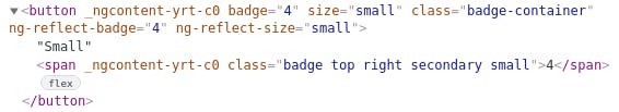
Here is how we use the directive in the template:
<button badge="4" size="small">Test</button>
<button
      badge="5"
      size="medium"
      position="top-left"
      variation="secondary">Test</button>
We also make sure to remove the element if the directive is destroyed. The above code can be optimized and also new features can be added to it, I'll leave you all to it. I just wanted to showcase how it was done and I hope I was able to do it with this blog post.
Code
Link (Recommended): codesandbox.io/s/ng-custom-badge-native-0vq9f
Link (Renderer2): codesandbox.io/embed/ng-custom-badge-ene1t
Connect with me

Do add your thoughts in the comments section. Stay Safe ❤️